HSBC Kinetic
Kinetic is a business banking app aimed at UK SME’s. Based on real-life insights from over 2,400 UK businesses, HSBC wanted to create something that was more than just a bank account. They are developing a banking service that will help SME’s transform how they do business.
What did I do?
Helping to lead the design work, I worked as part of an agile team designing all parts of the app that were Data and Insights driven. Owner of all of the data visualisations app-wide. I designed, prototyped, tested and prepared designs for development, working closely with our developers in India. Data and Insights were the largest team on the project, with the highest deliverables and luckily for me the most exciting design work.
I spent a lot of time making sure that data visualisations were accessible, and could be used by everyone. I was also part of the central design team creating a new brand for Kinetic, whilst remaining consistent with the fairly restrictive HSBC brand guidelines. This also meant that I was part of creating and implementing the Kinetic design system that was used by all designers, and developers.
Ways of working
During my time at Kinetic we worked in two-week sprints, within our project squads. During each of these sprints, time was allocated to doing research, creating or iterating designs, creating prototypes for usability testing, doing usability testing and getting designs ready for developers. It was a very fast paced project, and time had to be planned out very specifically as there was always so much to do. I also had to fit time in to add components to the constantly growing design system, and create videos/decks to present work to senior stakeholders.
Although there was so much to do, it was a really great way of working. I planned out future feature roadmaps with my product owner so that I knew exactly what features needed to be ready, and for when. This meant that the team could easily plan when and where we needed to spend time. Where research and usability testing needed to fit in, before final designs could be pushed to developers. It was a really user-focused project, and this way of working meant that we got to deliver things that we knew were what our customers wanted/needed and also met business goals/deadlines.

Navigation Pages
The main navigation pages were something that I worked on during my time on Kinetic. When I joined, the Alpha version of the app just had one home screen, so it was my job to create 5 landing pages which included Payments, Business, Support and More. The screens went through a lot of different iterations and rounds of user testing, as there was a lot of different inputs from different squads around the project, each with their own ideas on how these screens should look.
The concept above was what was agreed upon and launched in the Beta version of the app. It was clean and minimal (which fit well with the updated Kinetic brand), with a different feel from the original HSBC brand but wasn’t too far away. Customers could see a lot more of the content on the screen than in some of the other concepts, which tested really well. The screens flowed nicely, and also had a level of consistency with animations and styling that worked well from the main navigation.

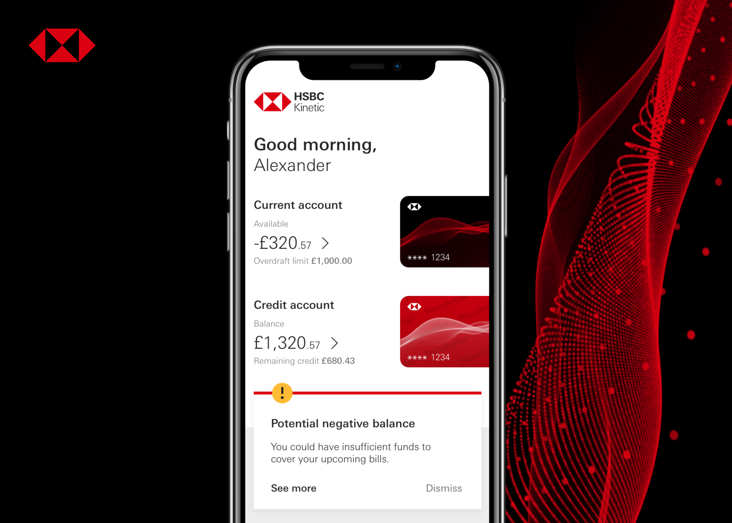
Insights Centre
The insights centre was created to deliver insightful pieces of information to the customer using data from their banking and accounting. This would help customers to manage their business more effectively, and gave HSBC the opportunity to deliver products and services to customers at the right time. Initially the insights centre was defined by business requirements and the design system that we had in place. However, after doing many rounds of usability testing on this, it was clear that there wasn’t a huge amount of customer interest, as customers didn’t see it being relatable and struggle to understand how they would use the insights they were given.
We needed to take a step back, gather some research from our customers and really put them at the centre of this feature. What is the problem we are solving by surfacing these insights to our customers? What started as a two week sprint ended in around 8-10 weeks of discovery, design and testing. This piece of work went through 4 different stages of iterations and solutions, before finally getting to the insights centre that was launched into the Beta app.
This solution looked like: There was a screen from the main navigation called ‘My Business’. This section held everything that was Data and Insights driven for the customer. Customers could view a messaging centre, where all of their insights were displayed. These insights gave customers actions that they could take to manage their finances better, like setting a spending goal or taking out a loan. Actionable insights were a really important aspect that we got from understanding customer needs.
We also designed the insights differently where some insights were more critical than others. This was based upon customer feedback, where users were concerned about potentially missing an insight that was really important, because it visually looked the same as all of the others. Customers could also view Cashflow and Spend analysis tools to see what was going on in their business. This page also gave the customers access to products and services, meaning they would find discounts relating to their type of business and also connect accounting software to better manage everything within one space.