Clear.Bank
I worked with Clear.Bank on a 6 month long project, to enhance the UX/UI of the onboarding and client portals. Initially it was agreed that I would update and enhance the portals to be more inline with the Clear.Bank brand and main website - however after some research and usability testing, it was clear that a lot of work was also needed on the UX side of things too. I was brought in as the sole UX/UI designer for ClearBank, and worked in a small team of engineers and business analysts. I also worked closely with the marketing team, and senior stakeholders to make sure that we were prioritising the right thing, and designing something within the brand guidelines.
During my time on the project, I also created a help & support section for both onboarding users and clients to raise tickets, speak to a virtual assistant and access knowledge guides to get the support that they needed with their application or account. The huge re-design that I worked on then led me into creating a design system for the company, to help guide engineers once I had left in designing and building the right thing and keeping consistency throughout.
Onboarding Portal
Here’s a view of what the portal looked like when I first joined ClearBank:
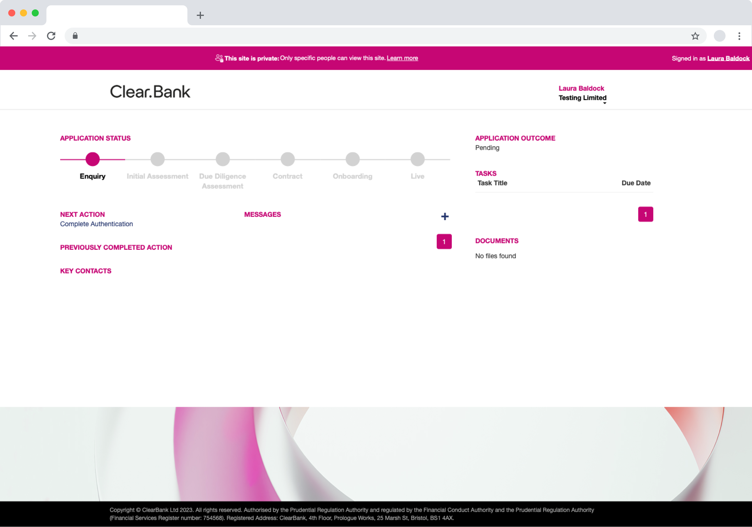
Unfortunately, the look and feel of the portal wasn’t the only major issue here. The usability of the onboarding application was particularly difficult. I found out hundreds of issues during a week or so of analysing the interface myself, and also watching previous usability videos.
It was so bad in fact, that clients needed to have calls with the developers on our team, in order to get through the application.
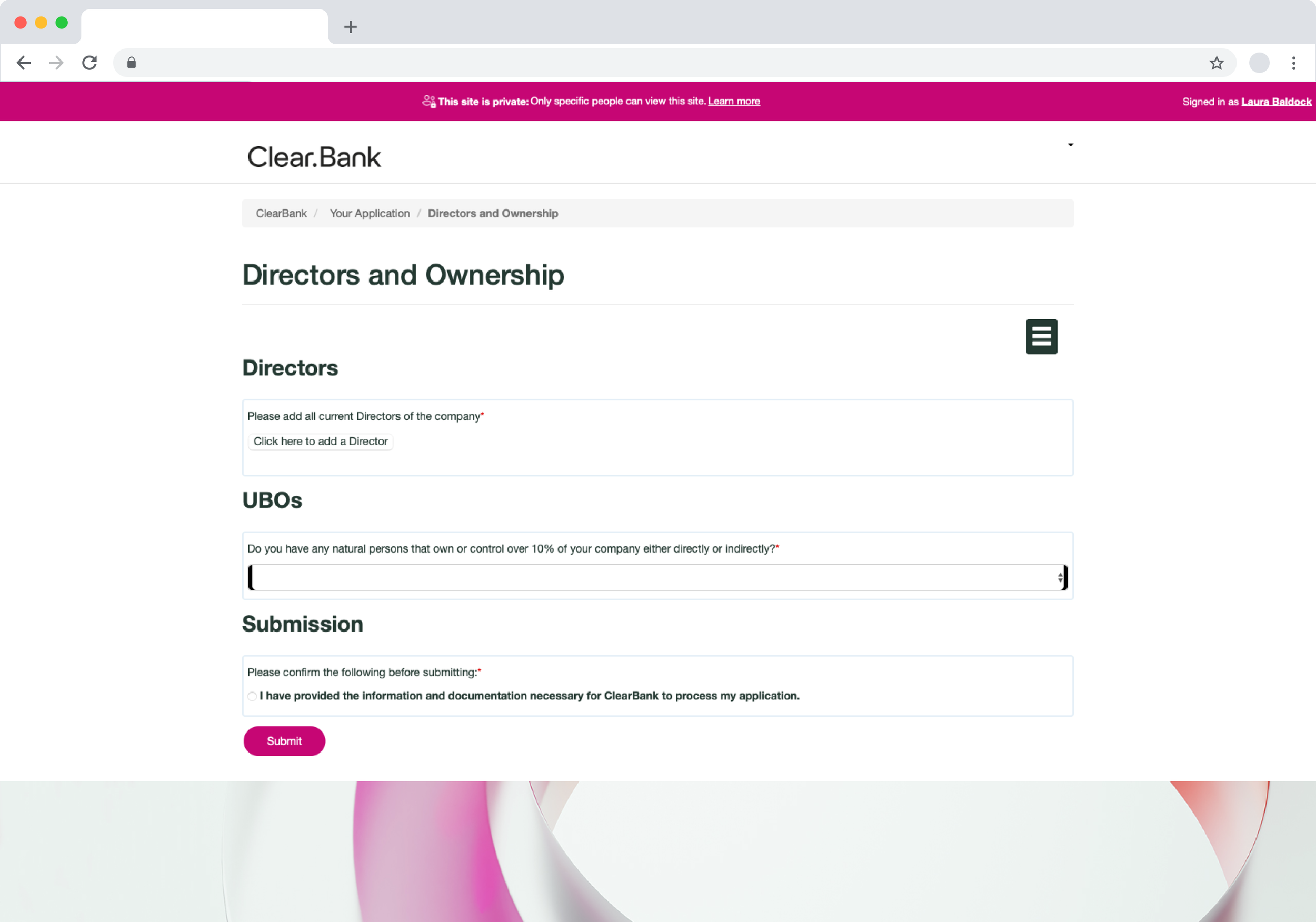
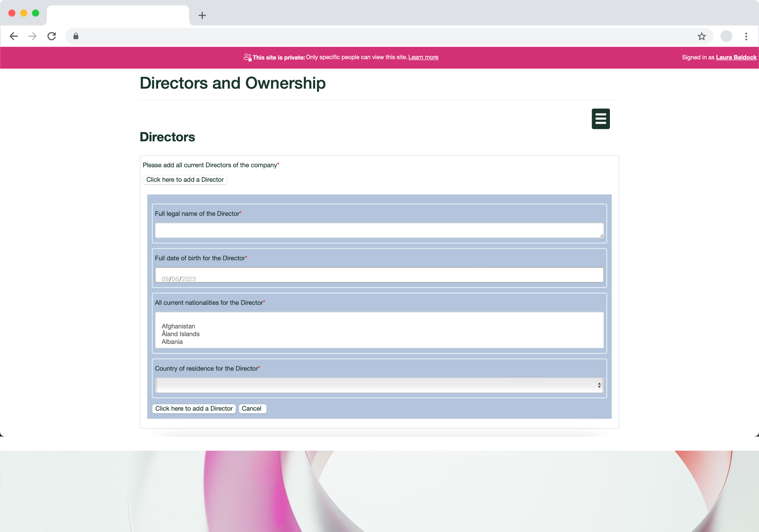
Portal re-design
During the analysis I created notes on all of the different screens within the onboarding flow, and then took my team and the senior stakeholders through all of my findings. We then prioritised changes into a V3 and V4, so that the work could be split and managed easily. The areas that we agreed to focus on for V3 was the usability of the form fields, making sure that copy was easy to understand, and enhancing the UI to make it more consistent with the main ClearBank website.
Each page has a short set of questions. All fields are consistent, meaning that users can easily click through each section within the flow.
User friendly fields
Making sure that everything from colours, buttons, icons and typography followed the brand guidelines, making it consistent with the main website.
Consistent UI
Progress bar helps users know where they are in the flow. Having tooltips where needed, for content that some users might not understand. Making copy plain english, instead of using jargon.
Understandable content
User Dashboard
Creating a dashboard was the next piece of work that I picked up after working on the onboarding flows. The dashboard would have a consistent design for both onboarding users, and clients, with slightly different content.
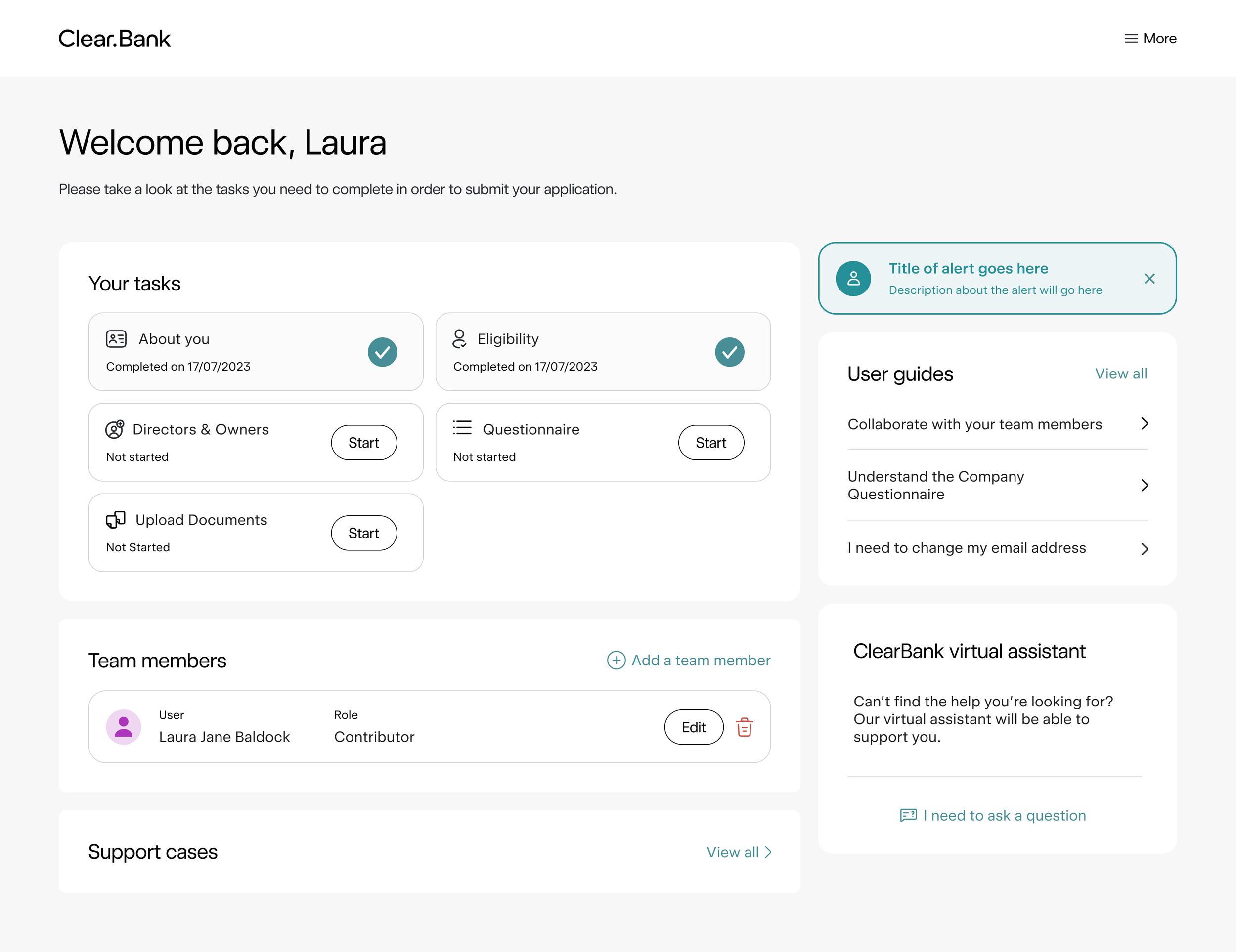
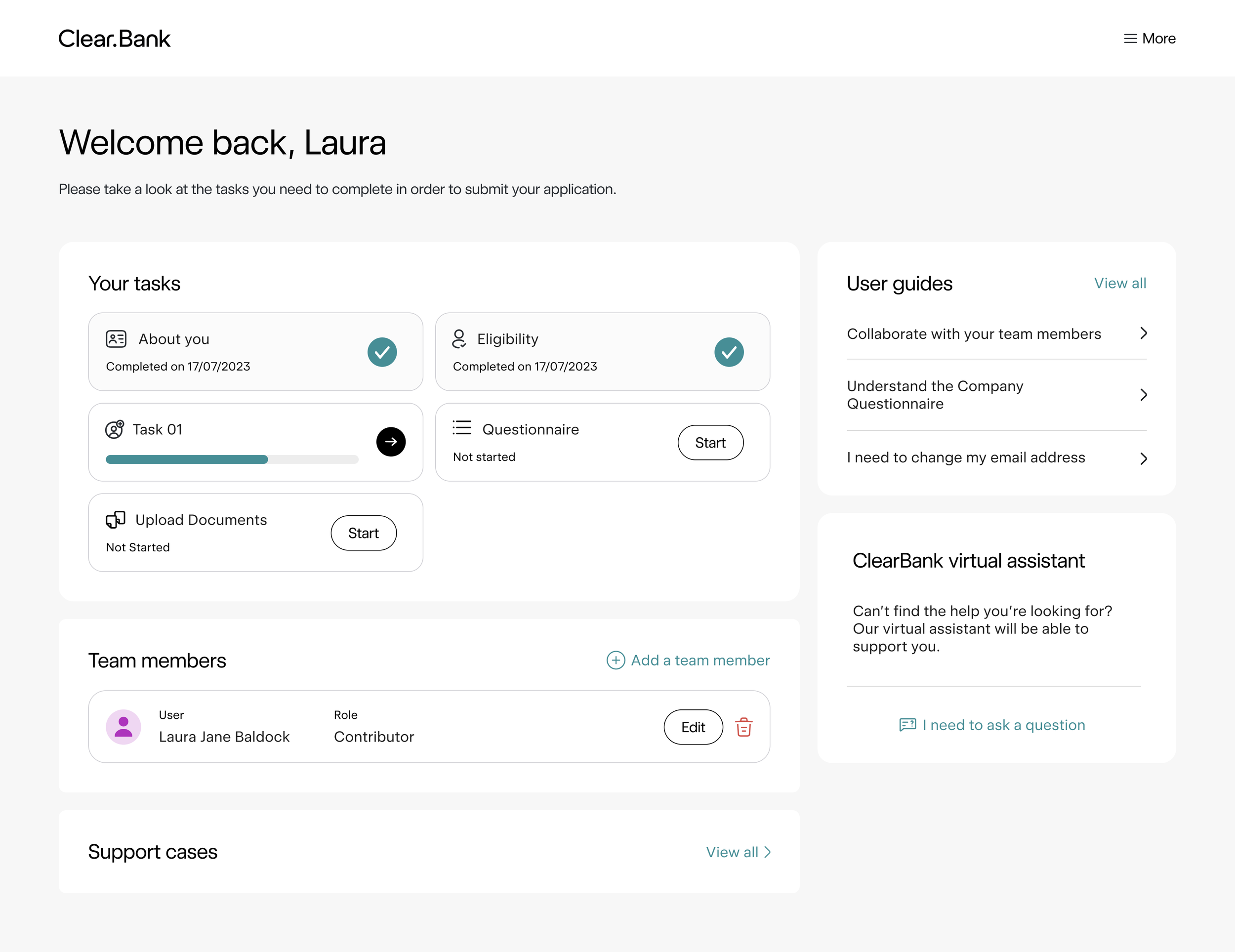
The dashboard needed to:
Allow users to easily see the tasks that they need to complete within their onboarding application
Have space for a help and support section which would eventually contain user guides, a virtual assistant and allow users to open cases.
Allow users to add team members to their application/client portal.
Show users when something new, or an error has occurred with their portal.
Help & Support
We decided to prioritise creating a help and support section for users once we had worked on the portal and dashboards. There was an issue with the amount of emails, calls and tickets raised from users, who were trying to make changes to their account, or complete something that they weren’t sure on. This was having an impact on the internal team, and meant that it was taking up to a week for clients queries to be answered or fixed.
To address this, we thought that it was important that users were able to self-serve within the portal, as it would mean a much faster turn around for them, but also take the pressure off of the internal team. I started by doing a load of research into how other companies offer H&S, and also how they allow their customers to self-serve. I created a Miro board of research from our competitors, and companies in completely different sectors. As a team we then prioritised and agreed from this research where we wanted to get to, and what was feasible in the first iteration.
An extensive knowledge base to help guide users through self-serving. We also give users chance to give instant feedback on the guides, to assist them into further help if required and for us to understand if the guide is helpful or not.
Large Knowledge Base
We created a virtual assistant that clients could access through their portal. This assistant would help support users and offer them guides in their chosen category, or assist them through opening a case.
Virtual Assistant
Users can open a case themselves directly within the portal. They have full control of managing the case, and have the opportunity to directly message their assigned case manager with any further queries if/when needed.
Case Management